 In higher education, textual materials are the most used forms for meaning making. However, as pointed out by Gunther Kress, being literate involves understanding not only words and texts but also multiple modes of representation. Meaning making happens through various modes, such as texts, images, graphs and moving images, and the interplay between the different modes. Multimodality already has an integral role in the Finnish National Core Curriculum and should also be given more emphasis in programs designed to educate future teachers and educational professionals at universities.
Some of us have had positive experiences using digital video composition, but are open to broadening our repertoire of multimodal practices to use infographics more effectively.
At the beginning are a lot of unanswered questions: What are infographics? What kinds of tools might be helpful to create or interpret them? What kinds of skills might be involved? How should I model processes of creating infographics?
As a social being, I (Carita Kiili) was not all that confident in thinking through these questions alone, so I partnered with Eliza Brinkman who is from Radboud University Nijmegen in the Netherlands and is doing a three-month internship at the University of Jyväskylä in Finalnd.
We started our inquiry project by searching for a definition. Mark Smiciklas defines infographics “as a visualization of data or ideas that tries to convey complex information to an audience in a manner that can be quickly consumed and easily understood.” To understand what this would mean in practice, we explored the website Information is beautiful by David McCandless. In one of his infographics, he describes the components of a good visualization as that which consists of a useful goal, integrity of information, a meaningful story, and a beautiful visual form.
At this point, we were pretty convinced that in order to reach a deeper understanding of the art of visualization, we needed to design an infographic by ourselves, using the aforementioned components.
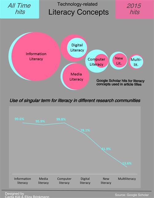
- Our goal was to create something that could be used in a digital literacy course. To that end, we came up with an idea to help us visualize literacy concepts in an infographic using Google Scholar as our data source.
- We constructed a search for particular terms that would align with aspects of the digital literacy course (so, the graph is far from representing all literacy concepts).
- To create an interesting story, we looked at some trends in time related to the frequency with which different literacy concepts appeared in the research literature. In addition, we were interested in how different research communities use a singular and plural form of literacy.
- To create a visual form for our infographic, we used a digital tool easel.ly. Along the way, many skills were needed including ICT skills, designing skills, and even mathematical literacy skills.
Here is our first infographic—showing that anybody can be a designer. During this journey with Eliza, I have built the needed self-confidence to design a course using infographics.

Because visuals are increasingly important in many areas of life, ranging from business to teaching, we are convinced that learning more about these types of practices will put us both on the right track for developing multimodal literacy practices that can be applied in higher education. We encourage you to join us in exploring how infographics can be useful in your own classrooms.

 Carita Kiili is a postdoctoral researcher at the University of Jyväskylä, Finland. Eliza Brinkman is a master’s student at Radboud University, in Nijmegen, The Netherlands.
This article is part of a series from the Technology in Literacy Education Special Interest Group (TILE-SIG).