In Frank Serafini’s book, Reading the Visual: An Introduction to Teaching Multimodal Literacy, he provides readers with a theoretical framework and pedagogical strategies to help students construct meaning during their daily encounters with multimodal texts. A multimodal ensemble text presents information across a variety of modes including visual images, design elements, written language, and other semiotic resources to convey meaning and engage readers, Serafini outlines. Some examples include music, images, movement, photographs, and written language that expresses meaning. Many artists, storytellers, and authors use different modes to communicate their ideas to readers. In this review, members of the Children’s Literature and Reading Special Interest Group, share literature selections appropriate for younger readers (K-4) and older readers (5-12) to support students’ navigation and analysis of visual images and design. Books like these often blur genre elements and are highly interactive allowing for a broader range of readership.
Younger Readers
Bryan, Ashley. (2014). Ashley Bryan’s Puppets. Photographs edited by Rich Entel. New York, NY: Atheneum Books for Young Readers/Simon & Schuster.
 Have you ever collected sea shells or other natural wonders to create something new and wonderful? In this extraordinary and spirited book, Ashley Bryan takes readers on a tour of his handmade and artistic puppets. Each page includes close-up photographs of Ashley’s marvelous creations partnered with a portrait poem filled with spirit and vision. The puppets are created with various items found on the beach near the gorgeous and tranquil Maine landscape. The photographs capture decades of careful artistry, vision, love, and imagination. This book is not only a celebration of creativity, but a gift to foster the imaginative spirit in everyone. The end page includes a special note about the puppet’s historical connection and date of ‘birth.’
— Mary Napoli, Penn State Harrisburg
Grey, Mini. (2014). Hermelin the Detective Mouse. New York, NY: Alfred A. Knopf.
 In this picture book, Mini Grey presents readers with multiple visual and intertextual clues that beckon multiple readings. This book opens with a full view of the Offley Street residents, including an introduction from its newest neighbor, Hermelin. Just who is Hermelin, you ask? He is an adorable gray-haired mouse who acquired his unique name off of a cheese box lid. He finds his way to an upstairs attic above 33 Offley Street, where he discovers a typewriter, paper, books, and other treasures. During an afternoon stroll, Hermelin discovers that his fellow residents lost some personal items. Emily lost her notebook, Imogen Splotts lost her teddy bear, and Mrs. Mattison lost her black leather purse. Determined to assist his new neighbors, Hermelin sets out to solve the mysteries. The grateful neighbors throw Hermelin an appreciation party, but when he shows up, they scream, “MOUSE!” Poor Hermelin dashes off to his sanctuary and learns, from the encyclopedia, that a mouse is an “unclean and unwanted pest.” Hermelin decides to leave, but his plans are deterred by Emily. She followed his trail and discovered this little mouse could help her fulfill her quest in solving more mysteries. This inventive and creative metafiction is a visual feast. It is full of clues, comic elements, and unique design features (i.e. case files) guaranteed to delight young readers. Teachers can conduct a multimodal illustrator study of Mini Grey’s work. Visit her website at: http://minigrey.com/
— Mary Napoli, Penn State Harrisburg
Hall, Michael. (2014). It’s an Orange Aardvark! New York, NY: Greenwillow Books.
 In this clever offering, readers take up the position of carpenter ants as they try to figure out the threat above their stump. One ant begins to dig peepholes, in the form of die-cut holes in the book. As various colors peep through the holes, the ant community worries what’s out there. In cumulative form, the holes and the colors are repeated with a range of exclamations (“Oh no, no no! It’s a pajama-wearing orange aardvark and it’s carrying a bottle of ketchup!). Both the text and the illustrations carry the humor in the story, from the ant’s hardhats to the collage-style art to the surprise ending.
— Lesley Colabucci, Millersville University of Pennsylvania
Joyce, William and Ellis, Christina. (2014) The Numberlys. New York, NY: Atheneum Books for Young Readers.
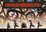 This book is truly innovative and interactive. Based on an app by the same name, the creators invite readers to partake in the creation of the alphabet. The story starts with black-and-white images and a vertical layout. The factory setting shows robot-like workers generating number after number. Until one day five friends wonder “if they could do something more.” The more leads to letters, and colors, and pizza, and sleep. The wordless pages, showing the industrial-style inventing of the alphabet, are particularly engaging and will spark creativity in readers. Online components are subtly noted on the back bottom of the cloth cover.
—Lesley Colabucci, Millersville University of Pennsylvania
Rosen, Michael. (2014). Send for a Superhero! Illus. by Katharine McEwen. Somerville, MA: Candlewick Press.
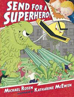 In this unique presentation, Rosen masterfully weaves a comic story within a story. In the narrative, Emily and Elmer’s dad read a comic book aptly titled, “Send for a Superhero.” The images of children curled up next to their dad, peering at the pages and asking questions, capture the natural excitement and enjoyment of bedtime reading. In the comic book story, the creatures, “Filth and Vacuum,” are described as “all-around bad guys” whose devious plan of destroying the world is deterred by the ingenuity of the “Happy Little Town” residents. The illustrator provides visual clues and varies her style as readers explore both stories. The insertion of comic elements (i.e. frames, gutters, thought bubbles, and narrative boxes) coupled with inviting storylines make this a must-read.
— Mary Napoli, Penn State Harrisburg
Spires, Ashley. (2014). The Most Magnificent Thing. Toronto, Canada: Kids Can Press.
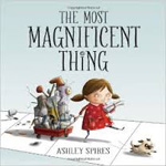 From the bold dotted letter “i” in the word “things” on the cover, to the row houses lining the endpapers, this book is expertly designed and illustrated. The digital artwork conveys the story through variation in color and page layout. Speech bubbles and panel art are set apart from a sketch-style backgrounds to show the little girl’s dedication and ingenuity. This charming story presents the girl and her dog as partners but the girl does all the work as she “tinkers and hammers and measures.” The protagonist struggles with frustration, as do all inventors, but her efforts prevail thanks to her creativity and problem-solving.
— Lesley Colabucci, Millersville University of Pennsylvania
Tullet, Hervé. (2014). Help! We Need a Title! Somerville, MA: Candlewick Press.
 Imagine opening a book that is in progress—one where the story is incomplete and its characters try to make the best of the situation. The cover is made of thick, black cardboard that resembles a sketchbook. When opened, readers will notice various marks on the page (i.e. crayon markings, doodles, notes, experimentations with color) as characters anxiously await for the author to develop and complete their story. To the characters’ great surprise, we, as readers, open the book a little too early as they announce, “Hey! Someone’s watching us!” As the characters interact with each other, they also entertain the reader. Through a little teamwork and problem-solving, they surmise the readers opened the book for a story and decide to call the author for an update. With a little persuasion, the author agrees to tell “one teeny, tiny story…” To his surprise, the characters were somewhat unsatisfied with his short story. In exasperation, he asks the readers to “Press here, please?” to turn off the lamp. The characters are left confused and with only a few pages left, they bid the readers goodbye. The visual design of this picture book metafiction is creative, inventive, and simply charming. French artist Tullet masterfully uses mixed-media and multilayered narratives to invite wonder, interaction, and delight. Through this playful text, readers are invited to explore the elements of a good story while being encouraged to “open and play” with the pages of their own text.
—Mary Napoli, Penn State Harrisburg
Older Readers
Blechman, Nicholas. (2014). Animal Kingdom: Information Graphics. Somerville, MA: Big Picture Press/Candlewick.
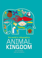 Information graphics include varied visual representations of data presented in a concise and easy-to-read format. In this architecturally rich design, Blechman includes interesting facts about animals. The bold colors and varied fonts are navigated by tabs devoted to the exploration of the animal kingdom (species, habitats, predators, etc.). Each section provides information to support further inquiry. This is a suitable print introduction of information graphics to support content area reading. In the classroom, teachers could use this text in a unit of study. Also, it can serve as a model for creating infographics. There are many infographic templates available online including Piktochart and Easel.ly. For those interested in learning more about how infographics support visual literacy, visit Kathy Schrock’s Virtual Guide to Everything.
—Mary Napoli, Penn State Harrisburg
Dillon, Patrick. (2014). The Story of Buildings. Illus. by Stephen Biesty. Somerville, MA: Candlewick Press.
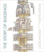 In this informative and impressive book about buildings, readers will glean an appreciation for architectural design. Each page contains interesting details about iconic historical buildings, including The Parthenon to modern structures, including The Chrysler Building. Labeled diagrams and pull-out pages add to the stellar visual presentation of historical facts of many architectural masterpieces. The unique blend of facts and story tidbits will inspire aspiring interior designers or architects. As Dillon states, “telling stories about buildings is as good as it gets.”
—Mary Napoli, Penn State Harrisburg
Rubbino, Salvatore. (2014). A Walk in Paris. Somerville, MA: Candlewick Press.
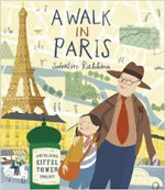 This homage to Paris is told from the perspective of a young girl touring the city with her Grandpa. The maps on the endpapers set the stage as the journey begins and ends with visits to the Place Saint-Michel, Pompidou Center, and Tuileries Gardens. Each double-paged spread chronicles their interactions as they travel, but also features informational text with details regarding French history and culture. In addition, French words are scattered throughout the art. The pages are quite busy, but the book functions as an inviting and interactive celebration of Paris.
— Lesley Colabucci, Millersville University of Pennsylvania.
Samworth, Kate. (2014). Aviary Wonders Inc. Spring Catalog and Instruction Manual: Renewing the World’s Bird Supply Since 2031. Boston, MA: Clarion Books.
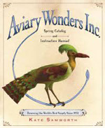 Designed as a faux-catalog and guide, this book is based on a future in which birds have been threatened to the point bird-lovers will need to create their own based on the products offered by this imaginary company. The first part of the book is organized by possible replacement parts: crests, collars, wings, legs, feet, tails, beaks, and bodies. The second half addresses “how to” assemble your new creation. Rendered in oil, ink, graphite, and colored pencils, the striking art captures the beauty of the birds while the satirical premise will leave readers wondering what they can do to advocate the aviary wonders all around us.
—Lesley Colabucci, Millersville University of Pennsylvania.
Schreiber, Joe. (2014). Game Over, Pete Watson. Boston, MA: Houghton Mifflin Harcourt.
 This lively book features plenty of humor, cleverly interspersed comic drawings, and hearty doses of silliness and over-the-top mystery. Pete’s obsession with video games will ring true for many young readers. He is desperate for the new “Brawl-a-Thon 3000 XL” game, but finds he needs to quickly raise money to purchase the game on release day. Innocently enough, he decides to have a garage sale and sells his father’s “vintage” console game system, CommandRoid 85. The sale of the game leads Pete back to old friends and to information about his father’s work. The story unfolds in a somewhat unbelievable manner, but the overall playful and dynamic style of the book makes it a worthwhile read.
—Lesley Colabucci, Millersville University of Pennsylvania.
Williams, Marcia. (2014). Lizzy Bennet’s Diary (Inspired by Jane Austen’s Pride and Prejudice). Somerville, MA: Candlewick Press.
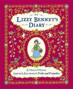 Marcia Williams provides Jane Austen enthusiasts with a compelling version of Pride and Prejudice, told through Lizzy Bennet’s point of view. Each diary entry captures Lizzy’s witty and charismatic personality as she records her observations and feelings. The diary, a gift from her father, captures the charm and essence of Lizzy’s retelling within an interactive format. Each page contains a diary entry accompanied by engaging visual elements, including cartoon drawings, recipes, real photographs of pressed flowers, fold out letters, menus, mementos, and invitations. The diary is delightful to read and captures the spirit of a young girl’s search for meaning and love. Intermediate and high school teachers might wish to partner Williams’ inventive diary with Rorick & Su’s modern adaptation entitled, The Secret Diary of Lizzie Bennet along with video diaries, tweets, and blog entries at http://www.lizziebennet.com/
—Mary Napoli, Penn State Harrisburg
These reviews and resources are submitted by members of the International Reading Association’s Children’s Literature and Special Interest Group (CL/R SIG) and are published weekly on Reading Today Online.